Y’all, I found something on my camera roll this week that I wanted to share. It was saved in a folder called “DD Inspo” — and it has inspired our entire DivaDance branding since we began franchising back in 2015.
As soon as I saw these 2014 covers of Kim Kardashian’s UK Elle magazine, I knew what I wanted. For whatever reason for this cover shoot, they chose two similar but different covers — both of which nailed the aesthetic I wanted in our soon-to-be franchise brand.
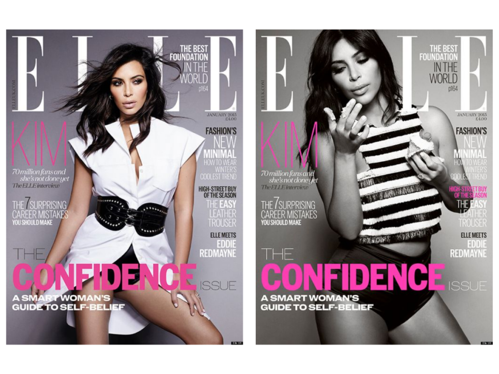
Fun fact: For many years, the darker pink on the left was our brand pink. Then a couple of years ago I decided to go with the “electric pink” on the right instead.
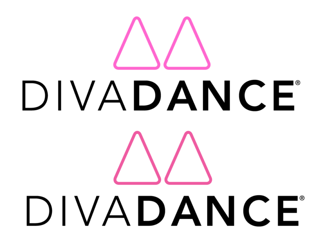
Our DivaDance logo is two triangles (not one!) for a few reasons:
- Our core value of Confidence: Triangles are a symbol of strength, stability, power, progression, purpose, and direction.
- Our core value of Community: Two triangles together, not just one.
- I also envisioned the sisterhood that would naturally happen in our studios, thus I chose the two “Delta” symbols — plus, running a sorority was one of the best experiences I had building community and running a business!
What I didn’t know at the time was that a triangle would show up in a few other ways:
- How we measure success for our franchisees = Financial abundance, quality of life, and values impact.
- How we define our brand standard “champagne-quality class” = Cardio, choreo, and connection.
- How our values should live in congruence = Who we are, what we say, and what we do.
- Things I’m beyond grateful for = To do something I’m good at and something I love, in a business that helps people.